|
Hello there, I wrote
this tutorial to help explain
how I make low-res
characters from scanned art that i drew. If
you don't know much about photoshop, try
reading my background art tutorial
to at least get a
sense of what tools I'll be using them and how i use them.
So, shall we begin?
|
|
|
|
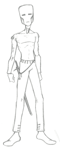
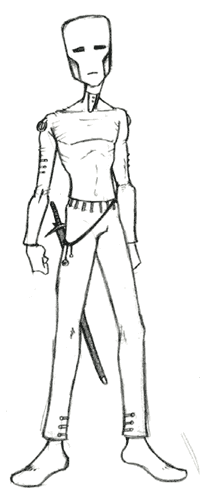
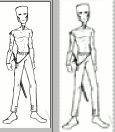
This is the sketch I'll
be using. It's just a little alien guy I used to draw all
the time, and he was supposed to be the main character to
my first game [backrounds can be seen here].
So I drew him and scanned
him in.
|
|
What I'm going to be
doing with him is resizing him to fit into a 320x200 environment.
Cause right now he is MUCH bigger than that. The first thing
I do [mostly because he isn't inked and the pencil lines
might get lost in the reduction] is darken those lines.
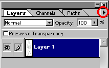
So I make a new adjustment layer and select curves.
|
|
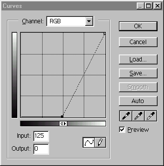
So I just dragged the
lower node to the center and it darkened the pencil lines.
Now that I can see it a little better, let's get ready to
resize it...
|
all darkned now
|
|
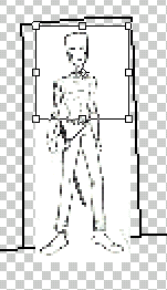
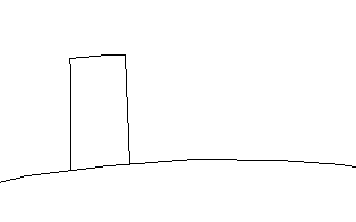
The first thing I do
to make sure the propotion of my character is right is,
I load up a backround that I have already drawn for the
game or I draw one quickly. Personally I like to work with
a background that has a door in it. Mostly because I think
that a character that looks wrong next to a door is one
of the worst things in a game.
|
|
Alrighty, so we have
our quick and ugly background. Now, I'll flatten the alien
image and then copy and paste it onto a new layer in the
background image.
It's quite big no? So
hit CTRL + T and while holding shift, rise the image
till the whole thing fits in the background canvas. REMEBER
TO HOLD SHIFT.
Then drag the shrunken
image onto the door and gauge the character's hieght against
the door. When you're pleased withi his height, hit enter...
|
|
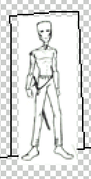
There we go, now we have
an awfully blurry but appropriately sized image. We can now
go ahead and copy the newly shrunken image over to a new canvas
and get rid of the background, it really serves no further
purpose. |
Since the image is
so blurry some people may not be able to remember what
their original image looked like, so if this is the case,
just open your original image up and use it as a non blurry
reference while the blurry one will act as a guide. No
worries.
|
|
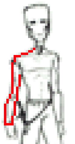
Now,create a new layer
and put it above your outline. Choose the pencil tool and
begin to trace. I'm using red because if I used black, the
line might get lost in the original image and I'd mess up
or not be able to see my traced line so well. So I'd suggest
using another colour for the outline and then just changing
it later.
|
|
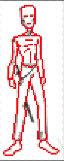
Ok, so I went around
my character with the red, getting all the important parts
and trying to keep the original pose and all that of the
line drawing.
I think he looks good
even though he doesn't look exactly like my pencil drawing...
But that's ok, he's a sprite now, not a sketchbook drawing.
So now that he's outlined,
we can start colouring.
|
|
Set the outline layer
to Preserve Transparency and draw over the outline
with some colour, here I made his skin grey and his clothes
green.
Then make another layer
and choose the flood fill tool [or press k] and with anti-alias
turned OFF! and with use all layers turned on, I flood filled
in the clothes and skin.
The reason I put the
colour on a seperate layer will make sense when it comes
to shading.
|
|
I didn't like how some
of the pixels looked so I went back and changed them just
to make it more pleasing to me and to help get his pose
better looking.
I flattened his head,
fattened his right arm and changed the shoulder on the right
arm also.
This, to me, is better.
So, let's shade this
mofo.
|
|
To shade I make a brightness/contrast
new adjustment layer and place it between the outline and
the colour, so that the outline is on top of the brightness/contrast
layer and the colour is beneath it.
This way, when shading
I won't accidentally change the colour of the outline.
Now, just like in the
background tutorial, I just start cutting light areas out
of the colour. I did my lightest lights first.
|
|
Then I added some wrinkles
to the knees and took out the dark lines in the middle of
the chest. I think it is best if the shadow defines his
form and not outline. I also added to the face, giving him
more of a character.
I also thinks it's good
to not shade the face of your character too much, leave
a lot of light on it because that is the face we are going
to be playing, so I personally want to see what it looks
like.
|
|
Now, choosing a lighter
grey and drawing on the brightness/contrast layer, I go
back in and add my second layer of shadow.
I'm only going to have
3 levels of shadow on this guy, dark, middle and light tones.
Knowing where to place
these shadows isn't really what I'm teaching here [and I'm
not an expert on it anyway] so just look around you at light
and shadow and always remember that light usually comes
from 1 direction more than the other. So try and have 1
side of the character darker than the other. This really
helps to define form and give the character weight.
|
|
Now, because he is an
army official, I'm added his medals and random shiny things
on his costume.
I just opened up another
layer and drew the colours on it. No big deal.
|
|
I didn't like how dark
the outline was around the character so I lightened it up
a little. On both his head and his body.
Now, the outline is where
we will focus next. We very well could just leave the image
the way it is and it would be just fine I think.
But I want to play around
with it a little bit more and try and add some detail to
his outline.
|
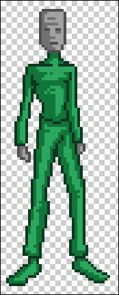
|
What I'm going to do
is take a darker colour green and [with preserve transparency
ticked on] draw darker colours on the left side of the image.
Then I did the same thing
with the grey of the hands and head. It isn't that noticeable
really, but I think for the minor bit of effort, it looks
better.
|
|
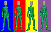
All that was really left
was too test the character against a couple of colours and
see if he looked ok. I used the primaries and then an odd
purple just to make sure.
I think he looks ok except
for the fact that his head kind of looks weird against the
blue and the purple.
|
|
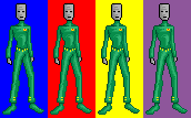
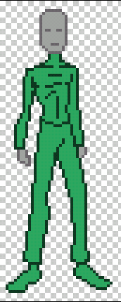
So just as another test
I used a much darker bit of grey to completely outline the
head and hands. This really makes his head stand out but
it also detracts from the green in some cases.
I dunno, it's up to you
how you want it to look.
And keep in mind that
in the upper colour bar test, not many games have large
areas of flat colour like that, so there probably won't
be a problem with the head getting lost in the background.
|
|
So there we have it.
A complete character shot drawn from a scanned pencil image.
It isn't hard at all really, once you get the hang of it.
Total colours used, 14.
I hope this helps...
eric
|