|
 |
|
 |
| Hello all, this isn't
a stand alone tutorial. Read the first tutorial on High-Res
background drawing and then this one because they are
almost identical except for a few certain... um... things...
ok, what ever i don't know what to write here and i should
be doing my Propaganda Art mid term essay but i'm doing this,
so let's get on with it. |
|
Take the backround sketch
and copy it to clipboard. Then open a new blank image and
size it to 320x200.
here is the image pasted
because the image is
larger than 320x200, it won't fit on the canvas
Paste the backround sketch
in and choose edit | transform | scale or CTRL T for free
transform.
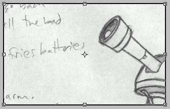
look at me! i'm scaling!
While holding
SHIFT make the image as small as possible, shift will keep
the aspect ratio of the image while resizing so that you
can't accidentaly squash it or stretch it. Then drag the
image around and resize it until it fits inside the 320x200
image. This doesn't work as well with this image because
I had intended this to be a scrolling room, so there will
be a large portion of the screen where there is no sketch,
so I would suggest when sketching your rooms on paper, either
do them at 3.2 inches by 2 inches or 6.4 inches by 4 inches,
this way you either won't have to scale, or you'll be able
to scale it exactly to your 320x200 image, make sense?
|
scaled to fit the canvas
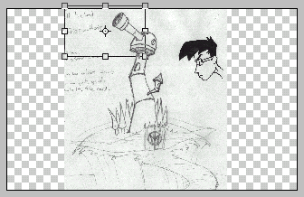
So when
the sketch is where you'd like it to be, hit enter and
that is where it shall remain. So now, basically, we go
about what was covered in the earlier tutorial, outlining
the image and colouring it in. But this time, I suggest
using a line weight of 1 and nothing higher, because when
this is shown on screen the pixels will be a little bigger
and may make the picture look bad. Also, since this is
a tutorial for 320x200 aliased backrounds, remeber to
turn Anti-Alias off on all tools you use and to use the
pencil tool for the outlining. And with that in mind,
I begin...
|
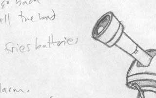
| As I was tracing, I noticed
that it's harder to get the pixels to do what you want in
some situations, like with small detail especially, I found
myself doing a lot of erasing and retouching before things
like the lens looked good enough for me. I would also suggest,
instead of using the lasso tool to cut away areas of light
and dark, to just use the pencil tool and outline an area
of light or dark and then fill it in after. It's easier to
control the pixels that way I feel. The lasso tool can't be
trusted with working this small. |
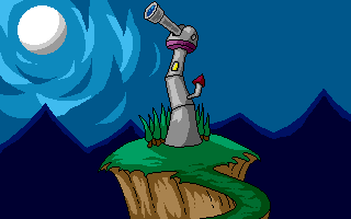
So this
is about as done as it's gonna get. I tried a new style
of clouds, I don't know how I feel about it yet. [this
is where eric points out all the problems with the drawing
so that no one can tell him later, cause he already knows]
I know I messed up on the lighting a bit but I still think
it looks fairly decent. I went pretty quickly on this
one so I left off the door and the window in the second
small tower and all the detail in the moon also I didn't
put as much detail into the cliff face as I would if this
were a backround I was seriously working on. Also, there
is a large wide open space of nothing in the upper right
sky... That just comes from poor planning and I have no
clue what to put in there, so it stays empty, but I think
you get the idea.
|
| I hope this helped a
little bit. I personally enjoy sketching on paper and then
transfering it to the computer, my mind just works better
on paper sometimes than it does on the screen. If anyone has
any questions or a suggestion for a way to do this better
or even a tutorial they'd like to see, email me please. |
| And that's the end of
that chapter - back |
|
|
 |
|
 |
|